

Goldstone Club
Role
Brand Planning & Space Design
Date
Aug 2023
Client
Private Client / Macau
“MASON”is a low-key and luxurious membership-based private club; "Mason" means "mining person" and also comes from the industry in which client is engaged.

The logo of "M Club" is inspired by the shape of minerals: the symbol on the left is a gold ore that stands out, and the right is a black rock mine that is ready to explore; the two support each other to form the shape “M”.

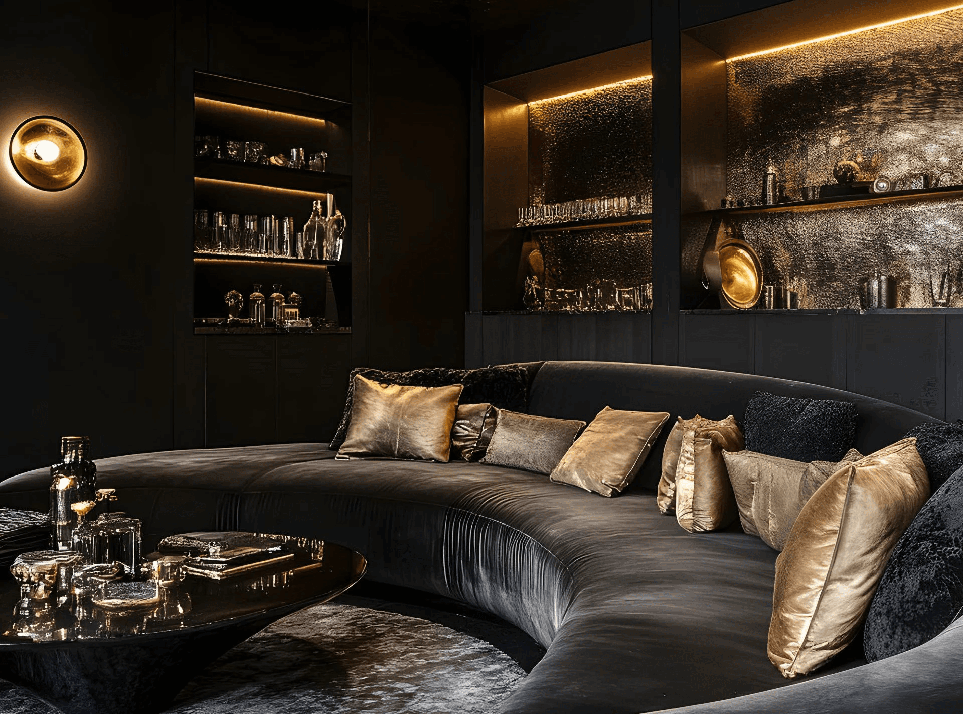
The spatial strategy of "M Club": In terms of language, combined with the location of the club - in a modern office building, we used the transition from straight lines to streamlined design language to undertake the transformation of the space from modern to private. The black matte color and golden glossy embellishments simulate the spatial drama of cave exploration.
The VI series is inspired by the rock formation profiles of ores, and also takes the form of an abstract smear-like "M" font.
